RT +
– Designing the new go to platform for "russ" all over Norway.
– Designing the new go to platform for "russ" all over Norway.
UI Design, Branding, App Design
Project overview
Every year thousands of highschoolers celebrate the end of school through "russetiden", an event unique to Norway where teenagers create groups complete with their own branding, clothes, vans and even busses. Having worked in the space for a long time, I was contacted by one of my previous clients who was working together with a app development company to create a social platform for "russetiden".
My contribution
For this project I was tasked with creating the branding and logo for the new app, as well as rapidly prototyping wireframes that could be used to communicate the basic functionality, visuals and structure for the app. The wireframes would be handed over to the app development company to be expanded upon by their in-house designer. I also helped out with creating the core concept of the app.

Brief
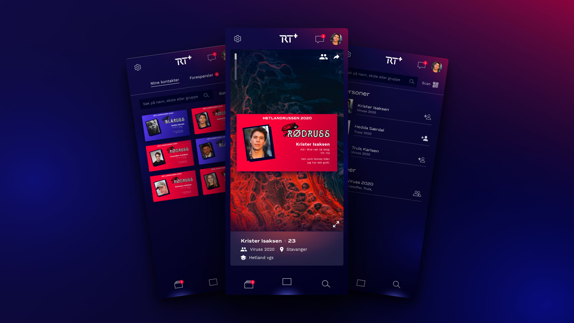
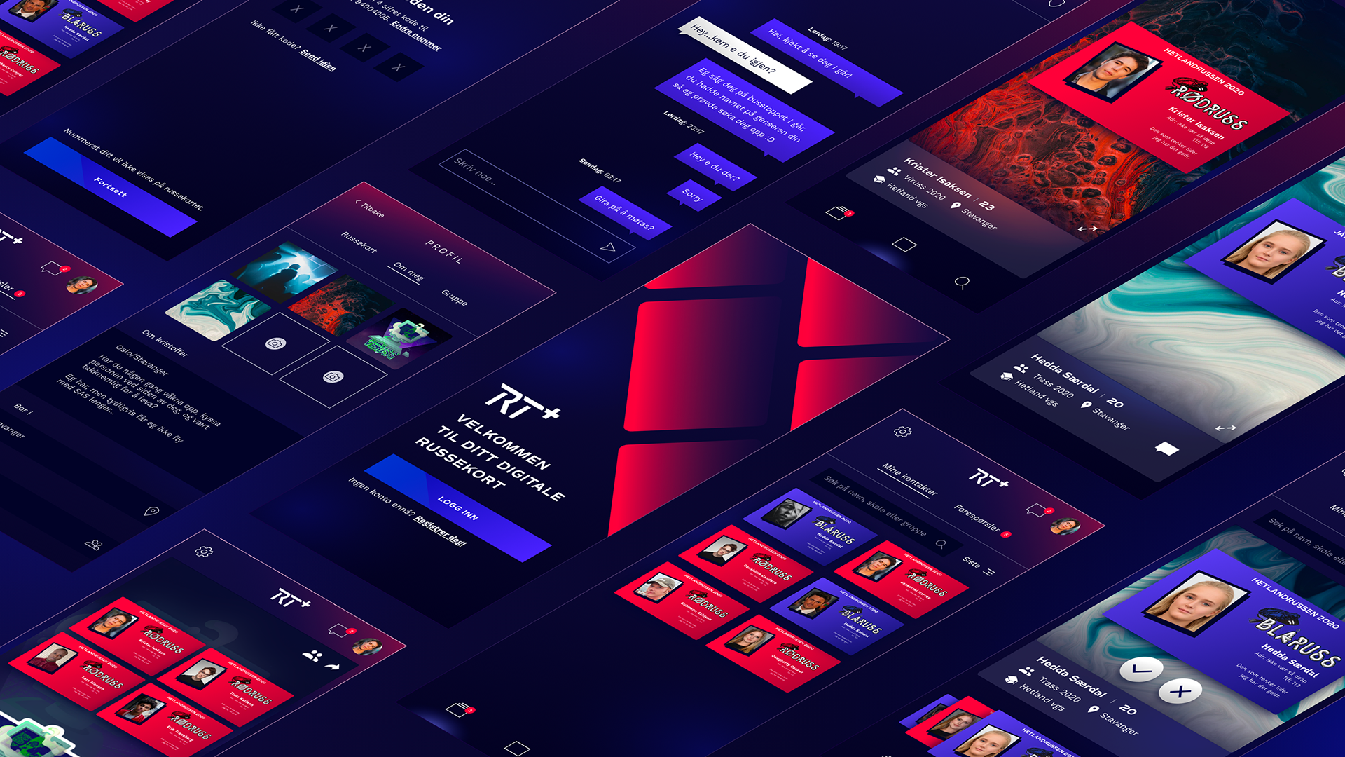
An important part of "russetiden" is collecting physical cards reminiscent of business cards with jokes and pictures each person creates for themselves. Creating a digital version of this card collecting would add an engaging gamification element to the initial social features of the app, which could then be expanded on in the future. For this initial pitch I wanted to focus on the basics of card collecting, as well as keeping the project within the very limited scope I had, only having 3 weeks to create both branding and wireframes..
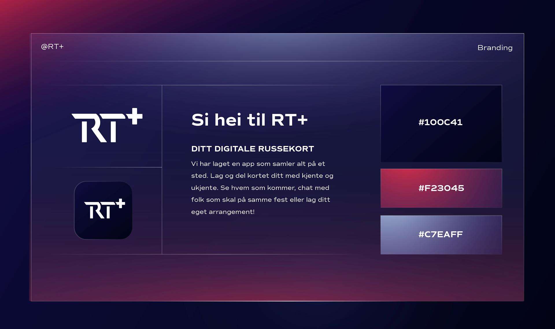
RT + Stylecard tries to capture the essentials of the brand in one image.
Branding
There are two types of russ, blue and red, and this color scheme is central to most russe-brands. I combined this color scheme with a contemporary skeuomorphic glass-like design, playing with gradients of blue and red to simulate lights hitting the different elements in the design. If this were to be the "next generation" of these russe-services, It should look sleek and futuristic. Exciting the younger user group by shying away from minimalist flat design, while still being clear enough to make for a good user experience.
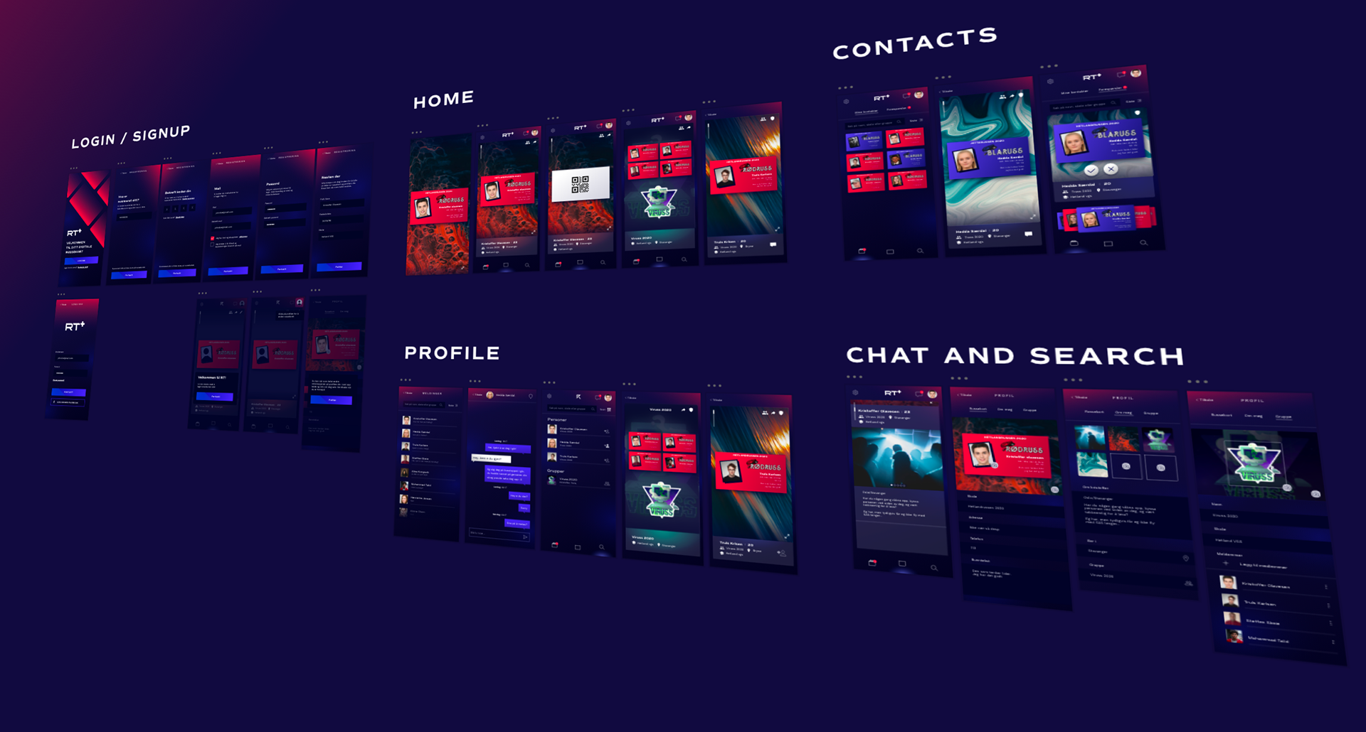
This iteration focused on 4 main functionalities, with more being added on in development.
Prototype
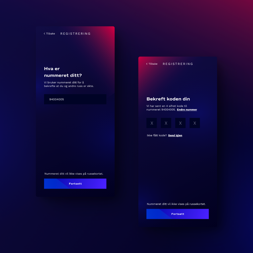
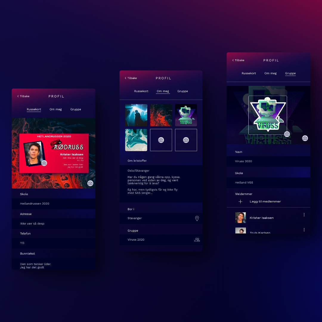
For the prototype I had a little under a week to create the foundation for the design language and structure of the app. My focus was on creating cohesive visuals and an engaging way to view and share your card. The three tabs focus around the basics, managing your card, finding others cards and viewing your collection. Since these people would often be partying together, I made it easy to access a QR code by flipping your card, which could be scanned to share cards. In addition there's also a search function. All your requests would then be added to a tinder like matching system, which would later be expanded to allow people to match by proximity.