
Coinbase Reloaded
– Using principles of data visualisation and interaction design to redesign Coinbase.
– Using principles of data visualisation and interaction design to redesign Coinbase.
Project overview
Ever look at an app and think: "I could do that better". That was the premise for my project exam in Data Visualisation, a course that looks at how to best represent and give value to data.
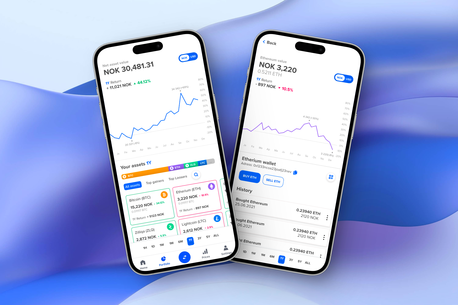
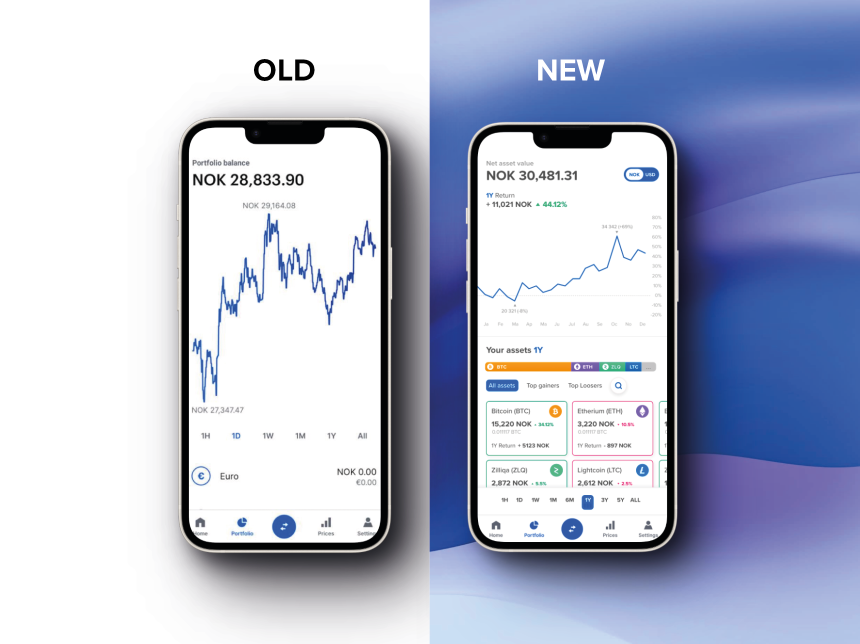
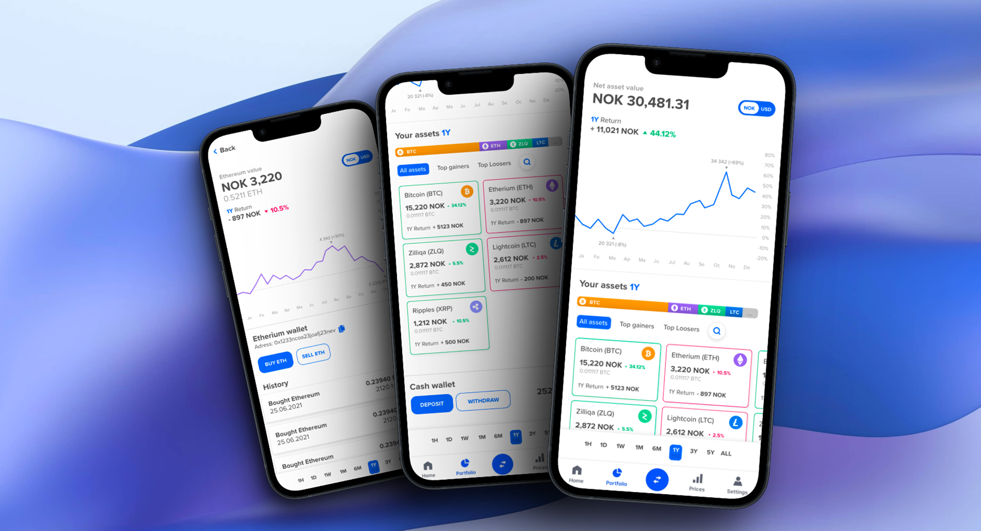
The task was to create a project-brief that utilises data visualisation techniques, which I chose to do in the form of an app redesign. Coinbase is one of the biggest platforms for buying and selling crypto, and while their interface looks nice and simple, I felt that a lot of usefulness of the portfolio page had been lost in making it so simplified.
My goal for the project was to analyse the app using common heuristics in interaction design and data visualisation to make a redesign that balances both usefulness with user friendliness.
👱♂️ My role
This was a solo project done over 2 weeks where I mostly worked on wireframeing and report writing.
🧳 Course
ADSE3200 – Visualisation
At the University of Oslo.
At the University of Oslo.
A course about the how users drive design decisions, where students have to create a digital prototype for a user group.
🧳 Tools used
Adobe XD, Adobe Illustrator

Video prototype
To showcase the main interactions I created a video demonstration for the app. As this was a data visualisation course, most of the effort was put into how the data is showcased, and how interacting with the timelines changes values for every change on screen.
The goal is to create additional insight by clearly viewing change over time, instead of more narrow snapshots in the original app.